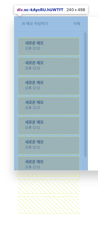
문제 원인
부모 높이는 자식 요소의 크기에 따라 결정된다. (∵ min-height : auto)
만약 자식 요소(item)가 overflow : auto 또는 overflow : scroll이 설정되어 있어 스크롤이 필요하지만, 부모 요소가 자식 요소의 크기에 맞춰 확장된다면 스크롤이 발생하지 않는다. (아래 사진 참고)
이때 부모 요소에 min-height: 0 을 설정하면,
부모 요소는 자식 크기에 맞춰 확장되지 않고, 부모는 원래 높이를 유지하며 넘치는 자식 요소에 대해 스크롤이 생기게 된다.

flex-basis:0 으로는 안되나?
flex-basis는 flex item의 기본 크기를 설정하는 속성이다 .
만약 direction이 width이면 가로 너비를, column이면 세로 높이를 기준으로 설정된다.
하지만 flex-basis:0 을 해도 위의 문제를 해결할 수 없다.
이유는 flex-basis보다 min-height의 우선순위가 더 높기 때문이다.
<!DOCTYPE html>
<html lang="en">
<head>
    <meta charset="UTF-8">
    <meta name="viewport" content="width=device-width, initial-scale=1.0">
    <title>Flex Basis vs Min-Height</title>
    <style>
        * {
            box-sizing: border-box;
        }
        .container {
            display: flex;
            flex-direction: row;
            width: 80%;
            background-color: pink;
            padding: 10px;
        }
        .item {
            flex-basis: 0;
            min-height: 100px;
            flex-grow: 1;
            background-color: #4caf50;
            margin: 5px;
            padding: 20px;
            color: white;
        }
    </style>
</head>
<body>
    <div class="container">
        <div class="item">Item 1</div>
        <div class="item">Item 2</div>
        <div class="item">Item 3</div>
    </div>
</body>
</html>
위 코드를 실행하면 아래 결과가 나온다.
1. .item
각 flex item은 flex-basis:0으로 설정되어 있어 기본크기는 0이다.
이는, item의 크기를 무시하고, grow, shrink 비율대로 공간을 나눠가진다. (flex-grow, flex-shirnk 설정이 없으면 콘텐츠 크기에 따라 공간차지)
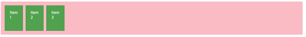
2. min-height : 100px
각 flex-item의 최소 높이가 100px로 설정되어 있다.
이로써 flex-basis:0 임에도 불구하고, 각 item의 최소 높이는 100px이 된다.
flex-grow : flex-basis를 제외한 여백 부분을 지정 숫자 비율로 나눠가짐
flex-shrink : 레이아웃을 벗어난 아이템의 너비를 분배해서 줄임
CSS 플렉스박스(flex) flex-grow와 flex-shrink 속성의 완벽 이해
플렉스박스의 유연한 레이아웃을 가능하게 하는 핵심 속성은 "flex-grow"와 "flex-shrink"입니다. "flex-grow"는 행에 맞도록 아이템의 너비를 늘리고, "flex-shrink"는 너비를 줄여서 행에 적절하게 배치합니
apost.dev
